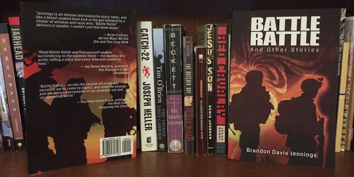
This is a first for the iStudio Blog – a post written by a user, Brandon Davis Jennings, and providing a user’s perspective. Brandon is an author, whose recent Battle Rattle Kindle Single (published by Amazon) was an Indie Pick of the Month for August, and was selected as a Best Book of the Year so Far by Amazon! Brandon has kindly agreed to share his experiences of using iStudio Publisher to design his book Battle Rattle for CreateSpace, for publishing in paper copy. Many thanks Brandon, and over to you…
When I started my writing career almost ten years ago, I never imagined I’d be doing things the way I am now. What I pictured was writing a book, sending it to an agent, the agent agreeing to represent it, and then some big publishing house forking over an advance so that I could live comfortably while working on my next book. None of this happened, partly because I haven’t really committed to finding an agent, but also because I’ve had success with Kindle Singles at Amazon and it is hard to turn my back on something that has been good to me.
Still it’s tough for me to be completely satisfied knowing that the stories Kindle Singles has published are available only on Kindle (or, in the case of Battle Rattle, available only in e-book and in audiobook form). In the past this might have been something I was forced to live with. I’m sure there is someone out there who is willing to publish a book of stories and novellas that someone already owns the digital rights to, but why on earth would I go through the time and energy of trying to find someone else to do that work for me when I have all the tools I need to do the job exactly the way I want it done? And thanks to iStudio Publisher only costing $17.99, all those tools were pretty darn cheap.
This post is aimed to help anyone who has already written (or will have written) a book that she wants to make into a physical book. I’m talking specifically about taking your text from Apple’s Pages, pasting that text into iStudio Publisher to do all your page layout and interior book design, and then exporting the file and uploading it to CreateSpace. Some of this stuff is going to seem very simple for people who are familiar with desktop publishing programs (and those folks might even have a few tips for doing things better than I did), but for anyone like myself, a person who had thrown his hands into the air and said, “I’m never gonna have to do that stuff,” and then came to terms with the fact that he is gonna have to do this stuff, this post will likely be filled with information that can help you to see just how easy it is to transform your digital book into a beautiful and professional physical book that you can drop into the hands of those readers who write and tell you that they really want a book they can, “Hold in their hands.” (Here’s looking at you, Aunt Sheila.)
Paste a Document into iStudio Publisher
I do my writing in Pages. No need to discuss it further, really. This method should work for any word processing program, though. I can’t guarantee that, of course. So if you encounter a specific issue because you use iStarbuckswriter or whatever, then don’t hesitate to contact iStudio Publisher’s support through email. Every single question I have ever had was answered way more promptly than I expected (even on a Sunday.)
I use shortcuts to select all the text (press cmd-a, and the text will be highlighted blue as it is in the following screenshot, and then press cmd-c to copy it).
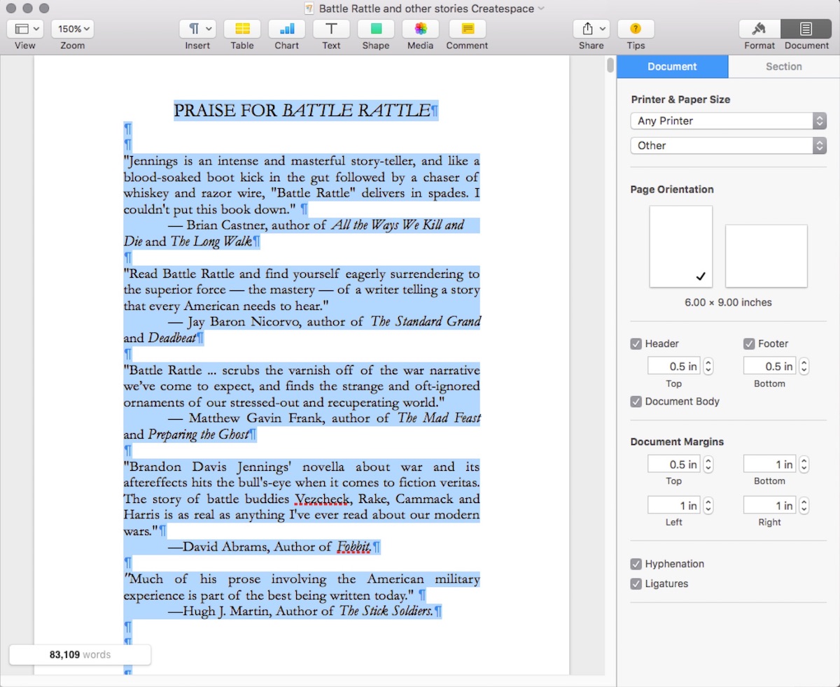
(Click each image to see an enlarged copy.)
Once you’ve copied your text, you have to open iStudio Publisher and create a new document. The first time I did this, I just opened a document with one page and didn’t select spread editing and made a ton of other mistakes that lead me to a series of extended copy and paste sessions that drove me to the brink of madness. I searched online for a way to import the document from Pages to iStudio Publisher, and then I searched for a way to copy and paste it that led me to an article showing how to copy and paste PDFs directly into iStudio Publisher from Adobe Preview, and then I copied and pasted all 224 pages of Battle Rattle and Other Stories into the iStudio Publisher document before realizing that I wouldn’t be able to edit the text of the PDFs and on and on and on. But, because I am an adult, and I no longer let things like this get me down, I contacted support and was given an answer to my problem.
So avoid all that silly stuff I did, and just follow these instructions. The following screenshot is an example of what your Page Setup should look like if you want to properly set up your iStudio Publisher document so you can paste all your copied text at once, and work in Spread Editing mode (if you care about the way your pages look when you open the book, then you want to work in spread editing mode).
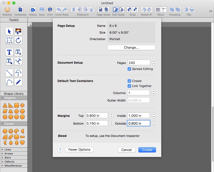
If you want your document set up differently, check the boxes for the things you want, and don’t check the boxes for those things that you don’t want. Simple. Let’s discuss the options for a moment so that I can explain why this is the setup I used. I was a teacher for a while, and I suppose that’s why I absolutely must explain the why to people.
First: I formatted the document as 6×9 because that is the size of my physical book. This is important for a number of reasons that don’t matter for an e-book. My cover was designed for a 6×9 book (by the amazing Eric Smallwood) and that meant I wanted the interior of my book to match that physical size. There was no option for a 6×9 layout on my Mac for some reason, but I just added it to the list of options manually, and voila.
Second: I made the document the most pages that I believed I would need for my physical book that way they were already linked with Text Flows (more on Text Flows in a minute), and so that I wouldn’t have to worry about adding more pages later. I don’t want to do extra work if I don’t have to. Work smarter, not harder. If you think your book is going to be 10 pages, just make it 100 pages and delete the unused ones later. (You don’t have to, but it won’t hurt anyone.)
Third: “Default Text Containers” was turned on because, unlike in a word processor, each page can’t just automatically be typed on. You have complete control over where the text boxes are positioned on each page, and if you want to copy and paste an entire document from a word processor into iStudio Publisher, then the text has to have a place to go. The place the text goes is called a text box, and by clicking the Default Text Containers box, you will eliminate the need for a step that I did the first time I tried to make a document without setting it up this way. That step is a repeatable step. You make a text box on one page, then you make one on the next page, then the next and the next until you are done with your document…224 pages later. It was not a pleasure.
Fourth: The reason that the “Link Together” box is clicked is because of a problem I encountered that you can avoid also. If your text boxes aren’t linked together, then they stand alone. So if you type too much on one page, the text that doesn’t fit disappears into the depths of some place where people don’t like coffee. So in order to link all those text boxes together if you created them one by one, you will have to use the Text Flow Tool (it’s part of the toolkit, but not something we’ll need to touch on because the folks at iStudio Publisher do a great job of explaining all the tools elsewhere) to link every single one of those pages together; that’s right. You’ll be clicking on one box, then clicking on the next one and repeating it 224 times, man. You’ll be shaking your fist at the sky and asking why on earth you didn’t just submit this collection to some book prize so that you could forget about it for the next year and a half. But if you do it that way (the way I did it the first time), then it’s your fault for not reading this amazing post that iStudio Publisher was kind enough to work with me on. So, right from the start, if you are pasting an entire document into iStudio Publisher, for the love of all things Holy, click the box for “Link Together.”
Fifth: “Spread Editing” is the way to go if you care about the way your book looks inside. You might think your title page and your table of contents look good on their own individual pages, but if they are on pages facing one another, you might notice that they look crooked or weird, and without spread editing, you may not notice the weirdness until you’re holding your book in your hands. As long as it’s the proof, that’s all right. But the fewer things you need to correct with your proof, the sooner you finish edits and get your book to market. Efficiency is important; that’s why I am writing this post. It’ll help you be more efficient. I swear.
Sixth: “Columns” should be set to one. You are not likely going to need more than a single column unless you’ve got some aesthetic purpose or some specific reason. If you do, cool. Good on ya’. My book is not a newspaper or The Bible, so one column is the way to go.
Seventh: “Margins” are a topic that could take up a ton of space in a post like this because there are many different answers to what your margins should be set to. There is great info about it on CreateSpace here. The margins settings I used are shown in the previous screenshot. Make sure that you read up on margins that work for the size and page count of your book, set the margins to accommodate your book, and then get on with business. Don’t just wing it if you want a professional looking book. I mean, you could accidentally get it right, but why risk it when the info is so easy to find?
Eighth: “Bleed” this is important for books with pictures in them. My book has no pictures in it because it’s not that kind of book. I do like pictures though, and will be using iStudio Publisher to do the layout design for my children’s books, and bleed will be important then. For now, if you are reading this because you want to format your book with no pictures inside, then you don’t need to fiddle around with “Bleed”.
Ninth: Click on “Create”!
Now that your document is created and open, all you need to do is click onto the first text box in your iStudio Publisher document, and then paste (cmd-v) your text into the document and you will be ready to get to work on the actual layout of the document.
Layout a Beautiful Book
I am not gonna lie and say that I have forty years experience designing book interiors (I’m not even that old yet). But I will tell you this; I’ve read a ton of books, and reading books requires you to look at them. And, in addition to that, I have read and read and read all kinds of book layout advice all over the internet. There is more info than any person can (or should) read, and the truth is that all you really need to concern yourself with is making sure that your book is readable and that it looks professional. I cannot stress the importance of a great cover enough, but that isn’t what we’re dealing with here. My covers have all been designed by graphic artists with much greater skill than I possess, and I suggest that if you want to have a great cover, you get someone to do it for you. (And by “do it” I mean pay them somehow; artists need to eat too.) But the visual interior of the book is just as important as the cover because, after all, the interior of the book is where the reader spends most of her time.
So what are the essential things to consider when it comes to book interiors?
Margins: The margins are essential and the reason for this is because a reader will be using her hands to hold the book open, and her thumbs will be on the pages, and if she has to keep moving her thumb every time she nears the bottom of a page, that is eventually going to annoy her. This is not good. If the inside margin is too narrow and the reader has to mash the book down with an iron to read the last word in the gutter, that is going to annoy her too. To avoid this nonsense, read up on margins at the link I posted above.
Fonts: There is also a ton of info about fonts all over the internet. I will tell you what I used and tell you why, and then you can dig deeper if you desire. I used 12 point font with Garamond for the body of the book. Garamond is a serif font, and serif fonts (they have the curves like the letters in this post) are (according to the internet) easier on the eyes. For chapter headings and so forth, I used Futura. Futura is a sans-serif font; it does not have the little curves. Sans-serif fonts are (again: according to the internet) better for titles and headings and so on. Rather than rage against the industry standards, I just nodded and did it that way. I like the way it turned out, so it will remain.
As far as how big title fonts or epigraph fonts or any of that is concerned, I found that the best way to get to an idea of what works best was to just select the text and adjust it until it looked “right” to me. Someone might have a math(s) problem that solves this; I do not. I am a mere mortal.
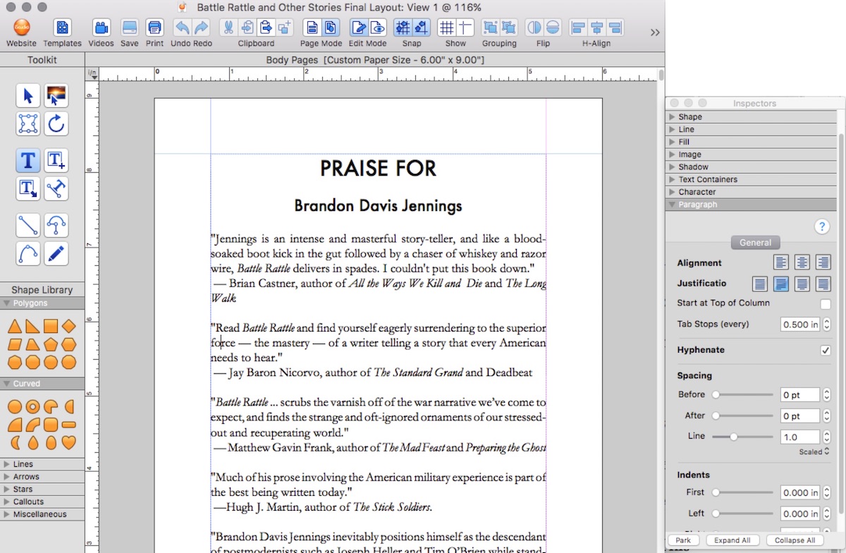
Justification: This is something that I didn’t think about before I found myself tumbling down into pits of formatting purgatory. I cannot think of a single book of prose that I’ve read where the text wasn’t justified. You know, each page is full of text from margin to margin? So I did this too. And, in order to avoid really weird spacing issues throughout the book, I had to enable hyphenation. This made the text fill the margins so that the book looks professional. Some people argue that ragged right formatting is okay for prose, but I’m not one of those people. Do what you like, but I did what I think looks best and what I believe will give the reader the best experience. Notice that “Hyphenate” is checked, and that the second box from the left is selected in the “Justification” row. That’s why the text looks the way it does in the screenshot of my document.
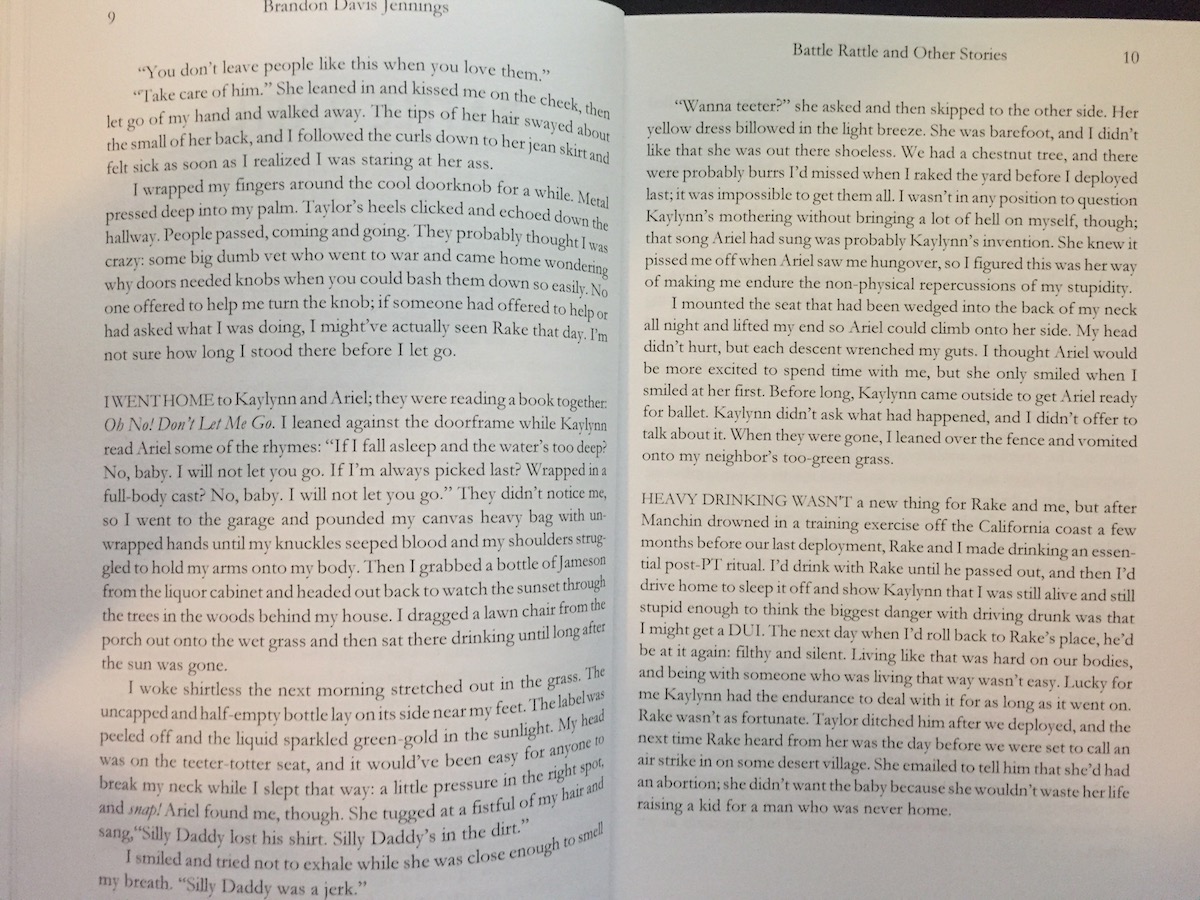
Headers and Master Pages: This is one of the coolest things about iStudio Publisher for a layout newbie like myself. One of most irritating issues I encountered with Pages back when I wanted to do the page layout with Pages was that I couldn’t figure out how to make my headers different on facing pages. What I mean, in case that was confusing, is that I wanted the left page to have “Brandon Davis Jennings” and then the right page to have “Battle Rattle and Other Stories” in the header, as shown in this photo:
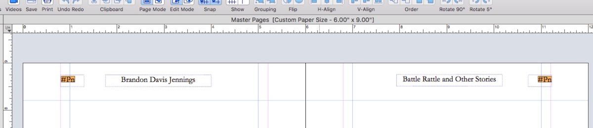
With “Master Pages” in iStudio Publisher, this is so easy to do. All you have to do is click on the Master Pages button (this is the left button that is located above “Page Mode” at the top of the iStudio Publisher window), and then add a header to the appropriate page.
With the setup I showed you earlier, you will have four Master Pages. Don’t worry about the first or the last one for this. We are only concerned with the spread master pages; these are the two Master Pages that look like a page spread. All you need to do is add a text box where you want it to appear on every left-hand page, and then type whatever you want into that text box. And then, on the right-hand page, do the same thing. If you want the same header throughout, just type it twice, but I think it is a far more professional look to have your name and then the title of the book on each page alongside the page numbers in the outside corners, as shown in this screenshot:
Where exactly you place the headers will depend on a number of factors, so you’ll need to move them around a bit to figure that out. You can align them perfectly by using the crosshair tool and the grid and rulers. And once you’ve sighted those babies in, it’s done on every single page.
“But, Brandon. I don’t want them on every page.” Guess what? I didn’t either, and now I’ll show you how to handle it.
Hiding Headers on Pages You Don’t Want them: So you’ve set up your document with the headers you want on every page, but you don’t want them on pages that are meant to be blank or on the table of contents or on pages with chapter titles or maybe you just don’t want a header on page 751. This is a breeze to accomplish. All you need to do is zip your cursor over to the shape library, click on the square, and then click and drag a rectangle that covers the entirety of the header and then let go. Your header is now covered by the shape you drew. Of course this leaves an unsightly line behind that no one wants inside her book. But what’s this! If you move your cursor over to the inspector box (if you closed it because you didn’t know what it was, then scroll down to the bottom of the screen and click on the box that looks like a magnifying glass “inspecting” some text and the inspectors window will reappear.) And then click on the arrow by “Line” and then uncheck the box that says “Line” and your rectangle will disappear. You’ll have to do this each place where there is a header or a page number that you don’t want, but it doesn’t take long and it’s easy to undo and you’ll be glad you did it because your book will look better inside if you don’t have page numbers and headers on pages that don’t need them. You can read more about this on the CreateSpace boards by doing a simple search or you can just trust me when I tell you that you don’t need a header on your title page, your table of contents, or chapter title pages. Think of it as saving ink and, therefore, the universe.
TIP: On the Document Inspector you can set the value for which page you want numbering to start on. I did this in order to make sure that the copyright page and the table of contents, acknowledgements, and so on were Roman numerals. This allowed me to have the numbering of the actual meat of the book begin with the first page of the story itself.
Underlining Headers and Chapter Titles: Clearly this is a matter of taste, but to have the Chapter Headings (not titles in my case) separated from the text of the story was important to me. In order to do that, all I had to do was mouse over to the line tool, click on the box to make sure snapping was enabled, and then click where I wanted the line to start, and then mouse over to where I wanted the line to end, and then I was done. A perfectly straight line that I could select with the “Pointer” tool and adjust to whatever thickness and color I liked. All the text (and also my author photo) is black and white in my book because I am not trying to do anything fancy; I just want to tell a good story. If you want pink lines in your book, you can draw them. If you want a rainbow underneath every title, you can do that too. I didn’t. So, you know, call me old fashioned. One thing I noticed was that there were times when I needed to de-select snapping so that I could manually adjust the distance of a line so that it wasn’t too far from the text. This was the result of text that was large enough that is overlapped a grid. So be aware that if you are trying to get a line near a word or whatever you want, then you may need to de-select snapping and then click on the crosshair tool so that you can get your lines perfect. I am a perfectionist (and perhaps OCD, so some of these problems may never occur to you; if they do though, now you know how to resolve them). Tip: You can ‘Nudge” line positions in smaller increments than the standard grid spacing by clicking the keyboard arrows keys. Just in case you need to fine tune things.
I already Did All That, Brandon. Now What? Okay. Let’s say that you spent a month perfecting your masterpiece and you’re ready to take it from iStudio Publisher and slap it into CreateSpace, so that the rest of the world can finally have a chance to glean all the insights you’ve been kind enough to share. All you have to do is mouse up to the top left of the screen while still in iStudio Publisher, click on File, and then scroll down to “Export Document as PDF”; click on that and save it to wherever it’s easiest for you to find (the desktop is fine for disorganized clods like me), and then you’re ready to upload your book to CreateSpace.
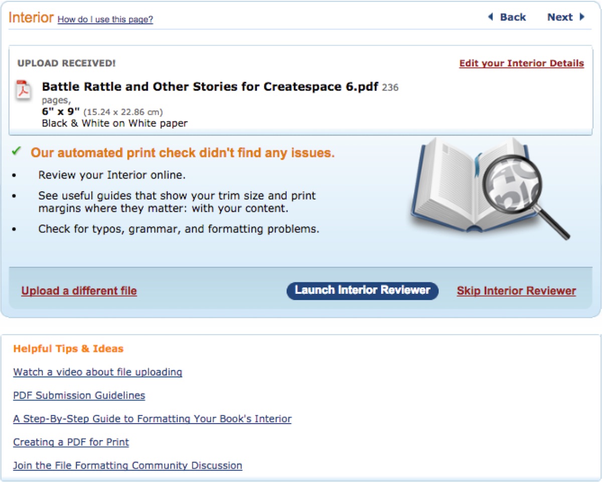
As you can see here, I’ve uploaded the sixth version of Battle Rattle and Other Stories:
This was after I did edits and ordered proofs. I edited the proofs, talked to my cover guy (Eric Smallwood) about some things, and then we resubmitted again.
Here is a little bit of what I learned so that you may not have to do the same thing I did. I’d prefer to order one proof and then edit that and then hit publish. I didn’t get to do that this time because there were a few mistakes. One of those mistakes was that I deleted the most current iStudio Publisher file instead of the PDF, so I had to do a lot of the same work over again. Not the most enjoyable Sunday I’ve ever had, but it had to be done. I wasn’t about to send an unfinished product out into the world.
Specifically, when I created my iStudio Publisher version of the document, as I noted earlier, I made a number of errors with formatting that had to be corrected after the fact. Now I know better, and if you read all that stuff above, you do too. But what I forgot to do was to make sure my inside (or gutter) margin was 1 inch. For a book in the page range that Battle Rattle and Other Stories is in, it is imperative that you set the inside margin to 1 inch. If you do not, then reading the book will be annoying. People will have to physically pull the book apart more than they want to in order to read the words along the gutter. So the new proof ended up looking amazing in every way except for this specific issue.
Trust me on this; the most annoying thing in the universe is reading a book that gives you tired thumbs. You want to do everything in your power to keep people reading your book, and one of the things that is in your power is making the inside margin wide enough so that they don’t have to mash the pages down with an iron to read the last few letters of every line.
The final note on this formatting business is that you really should learn from my mistakes and set up your document the right way from the outset. This will help you to get your document into iStudio Publisher the right way and allow you to focus on making it beautiful. Less redoing and more getting on to the next book.
Once you’ve got it all set up and CreateSpace offers you the chance to order a proof, I recommend (I really, really do) ordering that proof so you can look at the physical product rather than just using the web previewer available on CreateSpace. The reason for this is because it is cheap (probably less than 10 bucks unless you wrote a Crime and Punishment and The Brothers Kara-zombie), and then you can see the product that the reader will see. If you don’t do this, then maybe everything will be fine, but being able to see the physical thing and evaluate it the way a reader will be forced to evaluate it is well worth the small investment.
Here is the old table of contents and title page (made in Mac Pages):
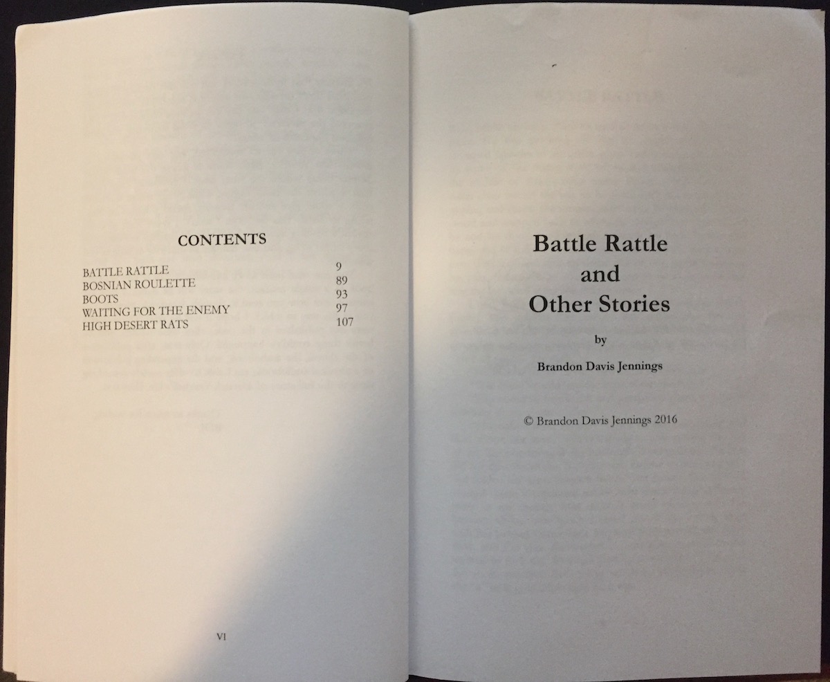
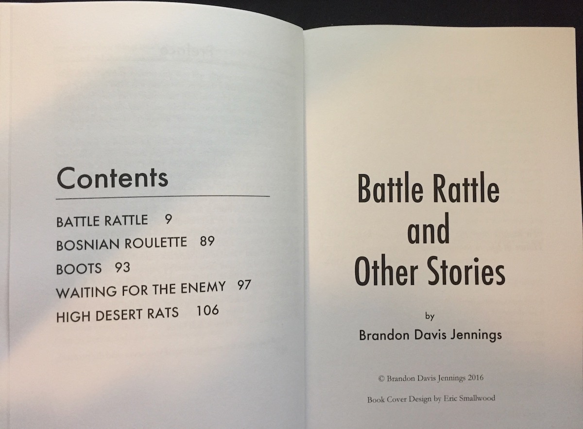
Here is the table of contents and the title page (still with the smaller margins) made in iStudio Publisher:
It’s clear to me that my investment both in the time it took to learn the software and the small price tag for iStudio Publisher has been very worth it. Now that I have more books in the works, and I am going to be a hybrid author (until someone pays me enough money to convince me that I shouldn’t be), I have found the program that I’ll be building my books with.